
ORIGEN
A sense of place, before the first sip.
A conceptual Veracruz coffee brand connecting place, material and ritual, from the packaging to the first purchase.
 ORIGEN
Good coffee can disappear among bags telling the same story. The challenge is to create a clear reason to choose it without inventing provenance claims or certifications.
A warm, precise identity. Photography close to the beans and brewing process, easy-to-compare product information and content built around an everyday ritual.
The system is designed to bring desire and clarity together: a recognisable brand, an understandable product and a direct path to purchase.
Four expressions of the brand, in one continuous sequence.
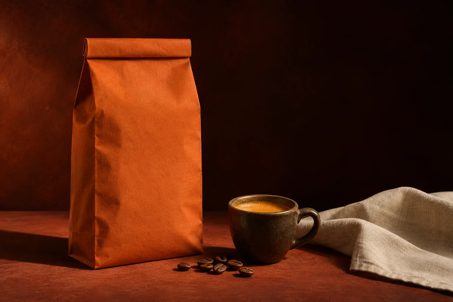
A study of light and material: coffee, paper and ceramic.Weighty typography, variety labels and room to read the product.
A name with weight and a palette drawn from coffee, earth and paper. The system distinguishes varieties through information and hierarchy, rather than decoration.
Start at the origin.
From bean to cup: recurring stories on brewing, storage and moments of enjoyment. Every piece offers a reason to return to the product.
“Start at the origin.” Product details lead into the brewing ritual, ending with a clear invitation to choose a coffee.
Coffee, time and a good reason to pause.
I want this for my brandTALK TO WLSN01The coffee
Variety, pack size and flavour profile in a product view made for comparison.
02The brewing
Methods and equipment explained alongside the coffee being considered.
03Your order
Grind, quantity and delivery before the order is confirmed.
A concept store with flavour profiles, suggested brewing methods and a visible purchase action. The image creates interest; the information helps people choose.
Brand, imagery and applications created for this demonstration. This is not an actual client, an active campaign or a measured commercial result.